03 /Case Study · B2B · Brand & Website
TapCXM -brand and website redesign.
The website still said Adobe implementation shop. The business had already moved on.
PMG led a full rebrand for TapCXM as they repositioned from Adobe implementation partner to global CX consultancy. I was design lead on the new website - responsible for UI design, information architecture and directing the copy brief for each page section.
Website Design Lead

TapCXM had evolved faster than its website had. The business had brought in senior hires from large UK agencies and shifted from implementing Adobe products to offering broader business and technology transformation consultancy. Internally that shift was clear. Externally the website still positioned them as a small regional implementation shop, heavy on vendor-led content and light on strategic credibility.
PMG were brought in to close that gap. The new site needed to feel lighter, more aspirational and credible - built to last five to eight years and to validate TapCXM's expertise with the calibre of senior client they were now targeting. The task: design a site that matched the consultancy they had already become.
Note: brand materials expected in July were received in late August, requiring the delivery schedule to be revised and the design work to absorb upstream dependencies without losing momentum. This pushed the project timeline and meant UX and UI decisions were made against a brand that was still being finalised.
The project began with immersion sessions to understand TapCXM's business, customers, market position and ambitions. Discovery surfaced a consistent set of priorities: fast, simple, credible and easier to navigate. The site also needed to work as a trust-building asset for prospective clients and a positive signal for future employees.
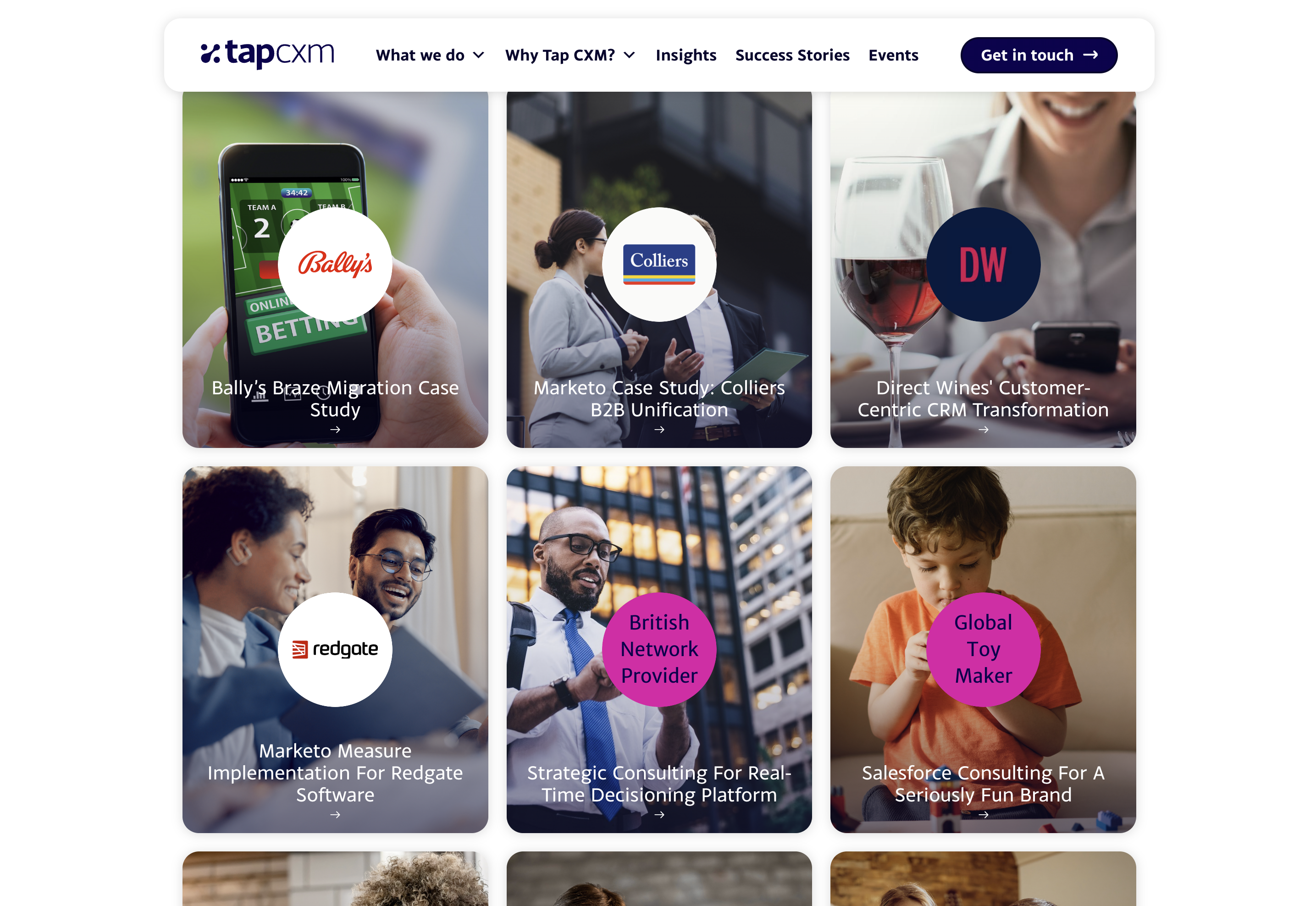
We reviewed 9 sites identified by the TapCXM team as direct competitors or aspirational benchmarks - Merkle, VML, Publicis Sapient, MRM, CACI, Reply, BlastX and Cognizant. We assessed how each positioned themselves, what content they prioritised and how they spoke to buyers at different seniority levels.
We mapped three key personas - CMO-level sponsors, IT decision makers and senior business enablers - across their tasks, goals, influences, feelings and pain points. Each had different entry points and different questions the site needed to answer: CMOs needed strategic proof, IT stakeholders needed technical credibility and senior sponsors needed to assess fit quickly.
- -Restructured the information architecture around core user questions rather than legacy content types, reducing Adobe-era bias and making the broader consulting offer easier to find and understand.
- -Elevated thought leadership and insights to primary navigation, positioning TapCXM as a business that leads with expertise rather than just service delivery.
- -Designed for three distinct personas with different decision-making criteria, so the site spoke to CMO-level sponsors, marketing stakeholders and technical enablers without becoming dense or unfocused.
- -Used bold visual language, fluid motion and a strong typographic hierarchy to signal ambition and signal the repositioning - directly addressing the brief requirement for the site to feel dynamic and aspirational rather than static and regional.
- -Distributed client testimonials throughout the site rather than consolidating them in a single section, placing social proof at the points of highest decision anxiety.
Homepage hero redesign
Competitor analysis showed that most consultancy sites defaulted to static, corporate aesthetics. Empathy mapping confirmed that CMO and CTO-level buyers were time-poor and making fast judgements about fit. We responded with two decisions in one: an animated gradient to signal visual differentiation from players like Merkle and Publicis Sapient, and a clear headline and value proposition above the fold so the offer landed within seconds of arrival.

Animated gradient hero with proposition above the fold, designed for fast senior buyer evaluation.


The site launched in February 2025. There were no quantitative metrics from a controlled experiment - this was a brand and repositioning project, not a CRO engagement. The measure of success was whether the new site expressed the business TapCXM had become.
“We're live! Brilliant! Thanks everyone for getting this over the line. I know this last couple of weeks has been a lot!”
The leadership team confirmed the new site successfully supported the launch of a new era of the business - a more credible and scalable platform that matched TapCXM's strategic ambitions.
Back to the start
01 /